venmo.
split pay the right way
Venmo. It is the most popular mobile payment app. It has recently gotten better with the introduction of Venmo Card and its Split Pay feature.
The feature's purpose is to make split payments easier, but sometimes it can be complicated in moments when not everyone has eaten in the same amounts.
What is the problem?
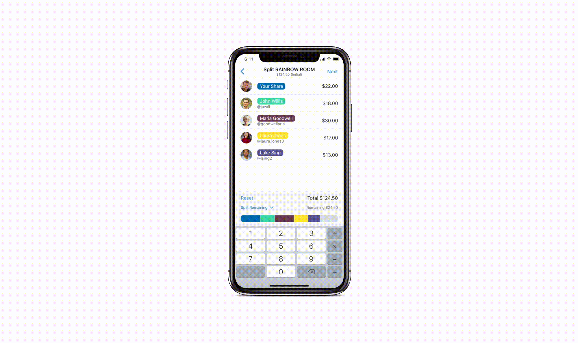
Venmo automatically splits the bill evenly among a group of selected people. However, consider when someone says that they ate less or someone ate more than others. The overall cost changes differently as you can see in the example below. Although the total cost does get reflected in the sticky tab, it does not display the remaining cost until the user goes to the final payment review where it displays the remaining cost in a small grayed out font. It is not efficient when users have to go back and forth between the two pages.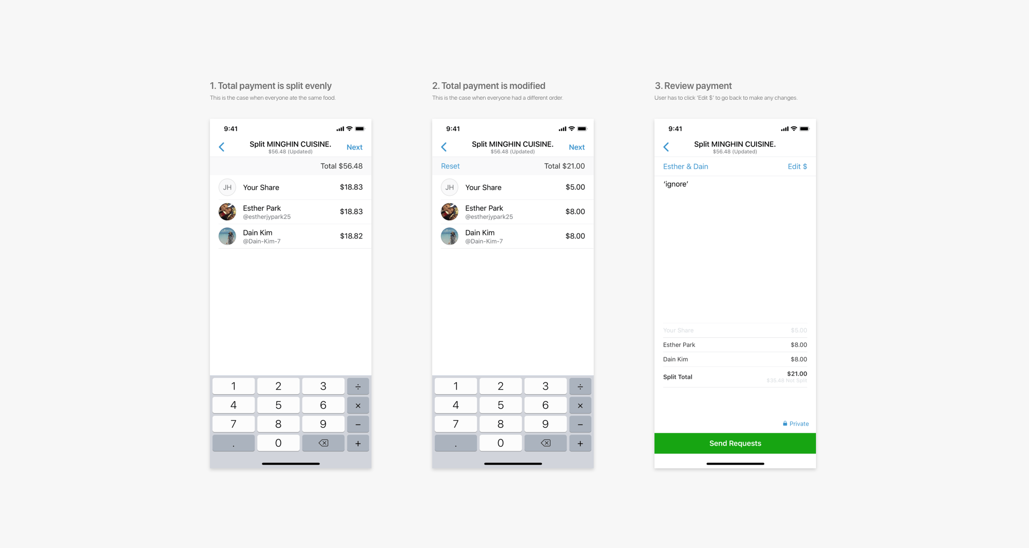
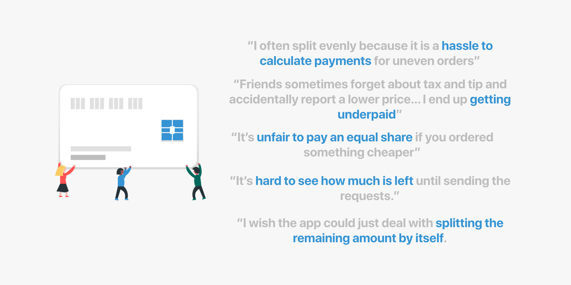
Shown below are some of the common feedbacks from users of the Venmo Split Pay feature. I asked 15 college students who utilized the Venmo card to provide feedback on the feature. It does not matter whether the users are college student or not, but the demographic of Venmo users are in higher education.
It seemed like there needed to be an improvement for the Split Pay feature
that would make the feature more efficient. Most of the issues came from how users had to split payments for uneven meals as well as visualizing how the bill is split.
Seeing how others do it
As of now, split payment seems to be a rare feature. It sure would be nice to be seen in other monetary applications. I looked into how other banking applications displayed money being divided into different segments. The main two options were pie charts and stacked bar graphs.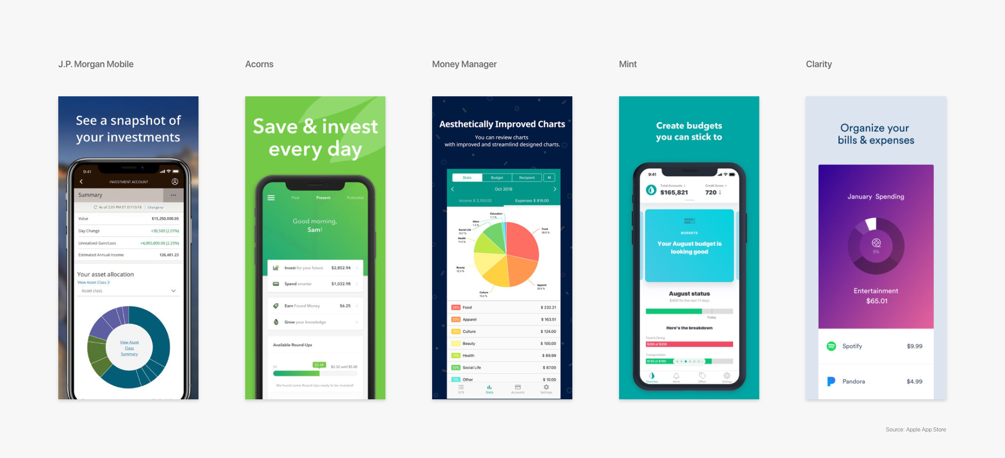
UI Elements + Limitations
Before going into brainstorming and sketching ideas, I first looked into what UI elements needed to be kept, edited, and added. Most were either kept or added. I also checked if there were any limitations, and one that came across my path was the space. Because of the top navigation bar and the keypad that are always displayed on this page, I had to be aware of the space constraint.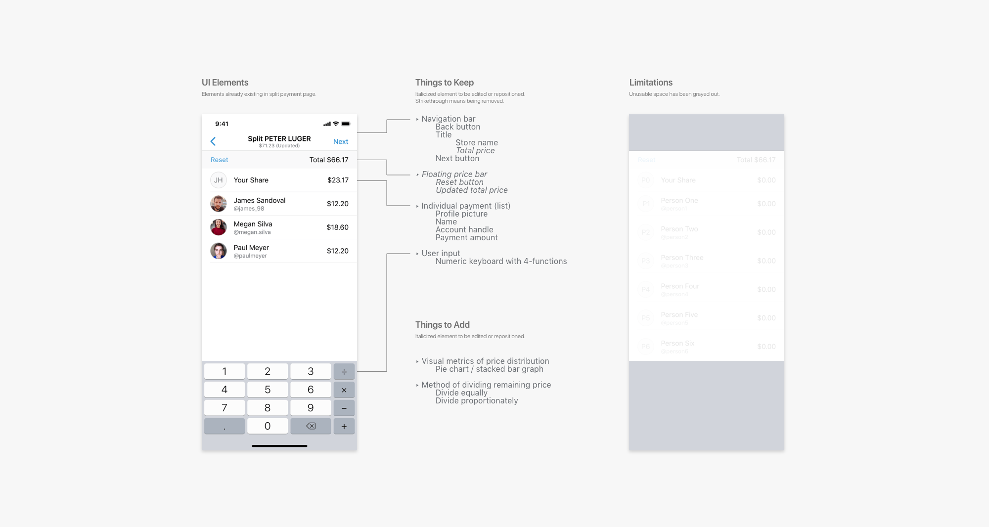
Ideating + Prototyping: Visual Metric
I first decided to tackle the visual metric portion as it seemed like layout of the page and UI elements heavily depends on the visual metric. I sketched different variations of the pie chart graph as well as stacked bar graph. As you can see, the graph takes up a big portion of the available space.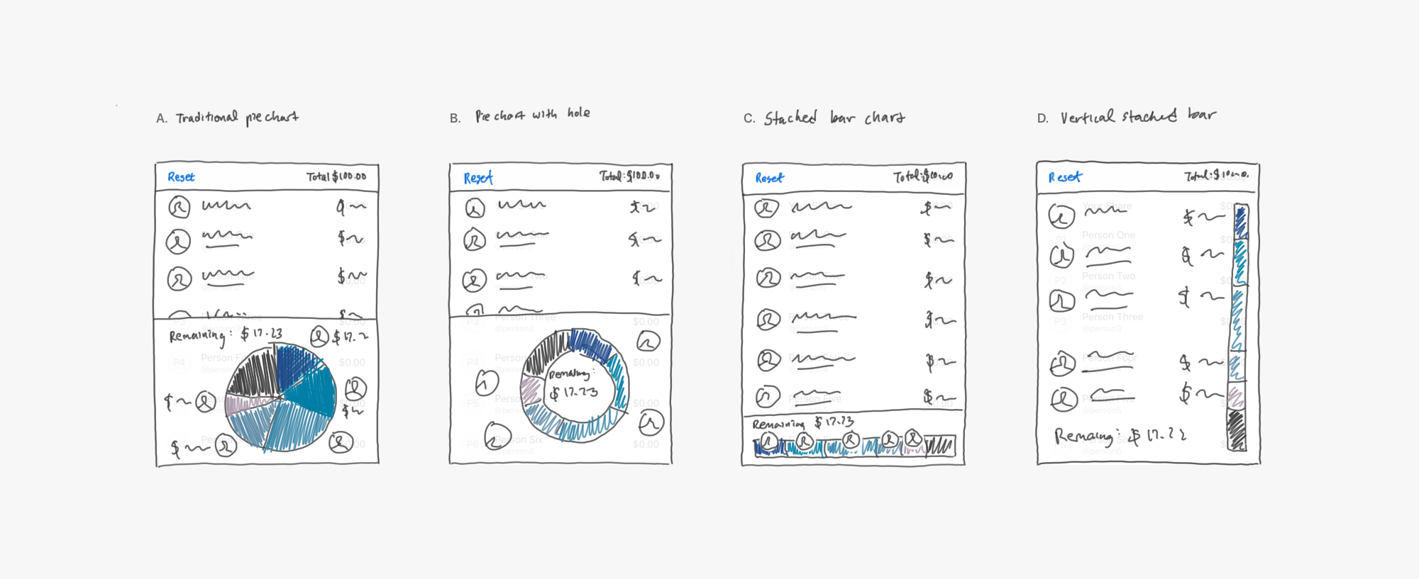
- Traditional pie chart with profile pictures to signify which portion belongs to whom. It also displays remaining cost on top.
- Similar to traditional pie char, but it has a hole in the middle, thus saving space and giving room for the remaining cost to be displayed there.
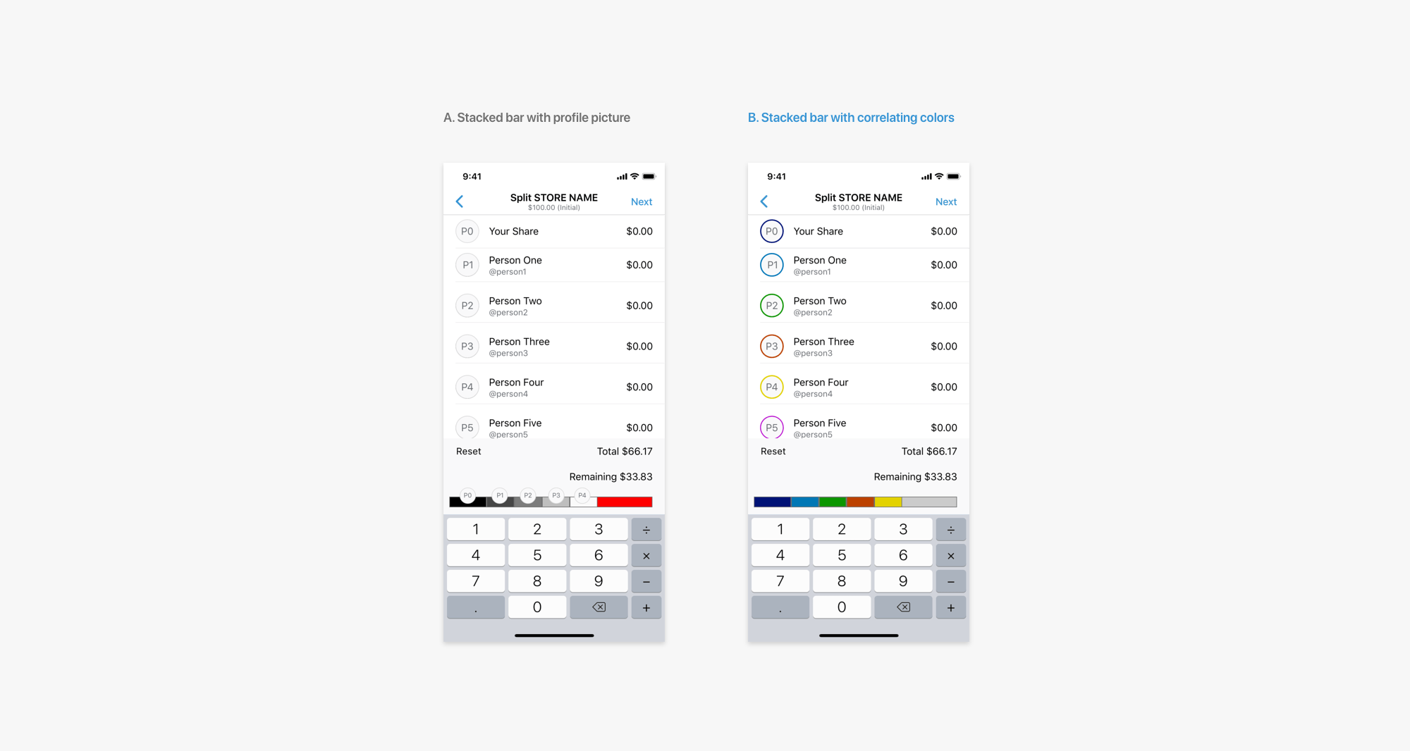
- Horizontal stacked bar graph with possibly color to marking individual payments.
- Vertical stacked bar graph. The individual payment informations are lined up with the bar.
I decided to select option C as it saves a lot of space compared to options A and B while still providing the same feature. Option D is also nice but it is only when everyone can be fitted into the whole page. It provides another design hurdle in the case the list has to be scrolled, which means that the bar would also be scrolled. This would lose the purpose in providing a general view for comparision to overall bill and to each other.
Once selecting option C, I realized there were more layout options available within that option.
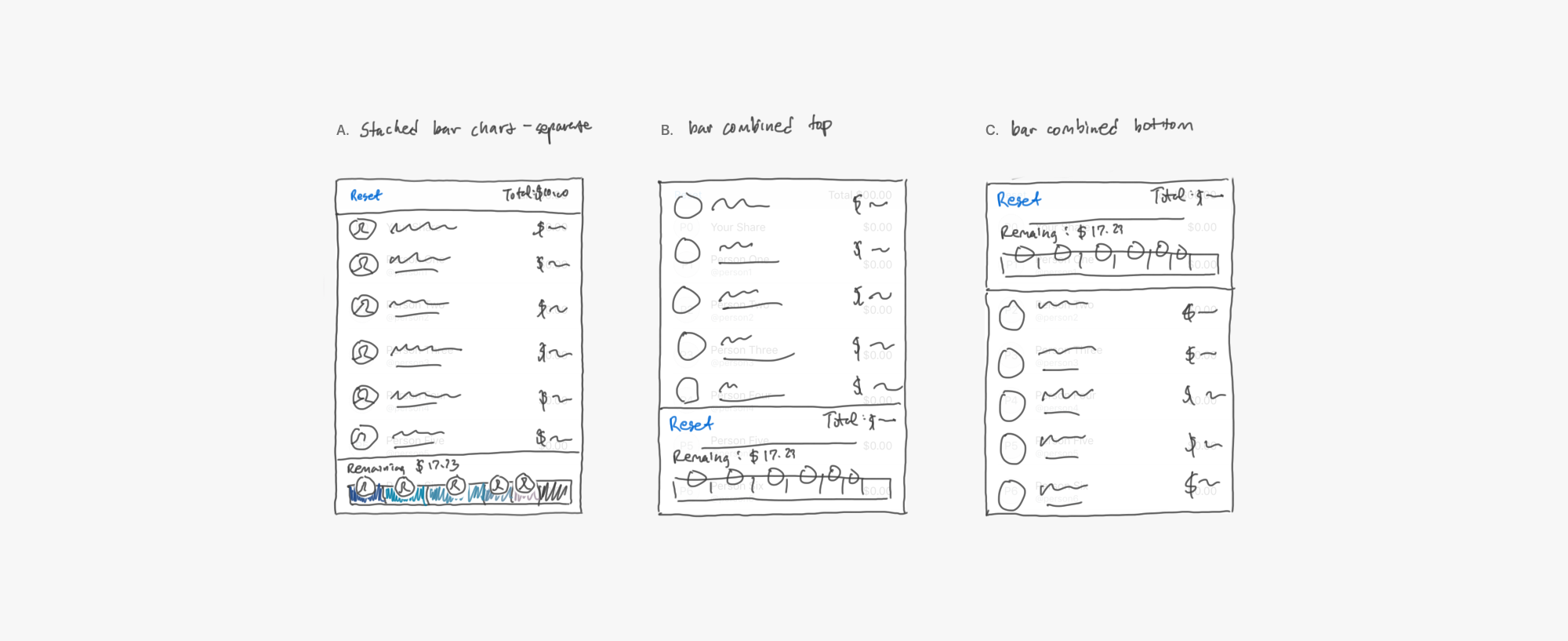
- Original horizontal stacked bar.
- Combined stacked bar with total cost metrics aligned to bottom.
- Combined stacked bar with total cost metrics aligned to top.
Compared to option A, option B and C seemed more organized and fitting to combine metrics of total cost and remaining cost. I ended up selecting option B as the layout is similar to how information is displayed in the next page. Like a receipt, the information is displayed at the very bottom.
In order for users to understand the stacked bar, they need keys to correlate different parts to different individuals. I decided to use colors as that was a minimalist approach. I chose to apply the colors to name badges as it was easier to see than profile borders and dot markers.
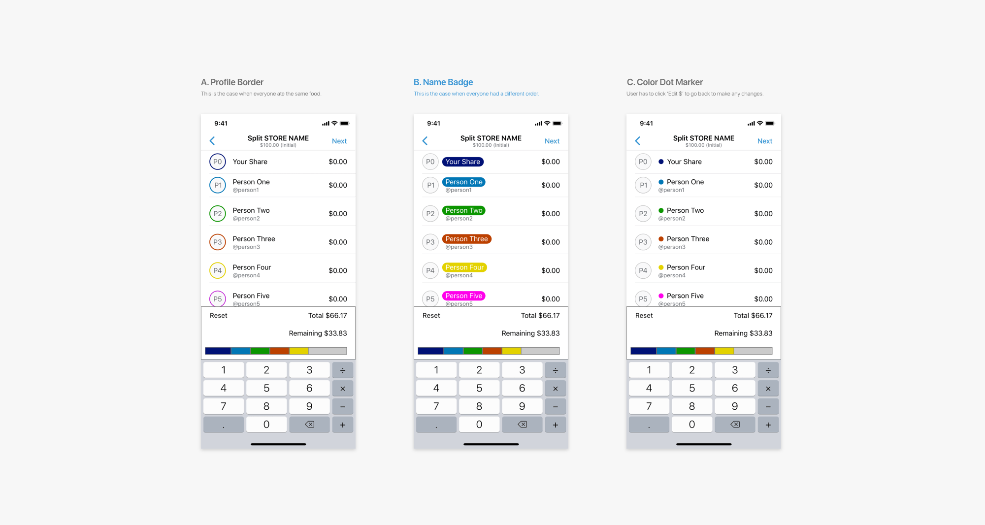
Because the point of colors is to mark different segments to individuals, it is important that they are distinct, not similar. The hues must be different in order to them to be easily distinguished apart.
However, the colors must also fit in with the primary and secondary colors of the Venmo brand for a better visual harmony.
Engineering perspective: Since random colors can not be selected, developers must be provided a palette of random colors that they can select from. The palette should have a finite number of colors (around 20~ colors) since that is the maximum number of split pay individuals.
Engineering perspective: Since random colors can not be selected, developers must be provided a palette of random colors that they can select from. The palette should have a finite number of colors (around 20~ colors) since that is the maximum number of split pay individuals.

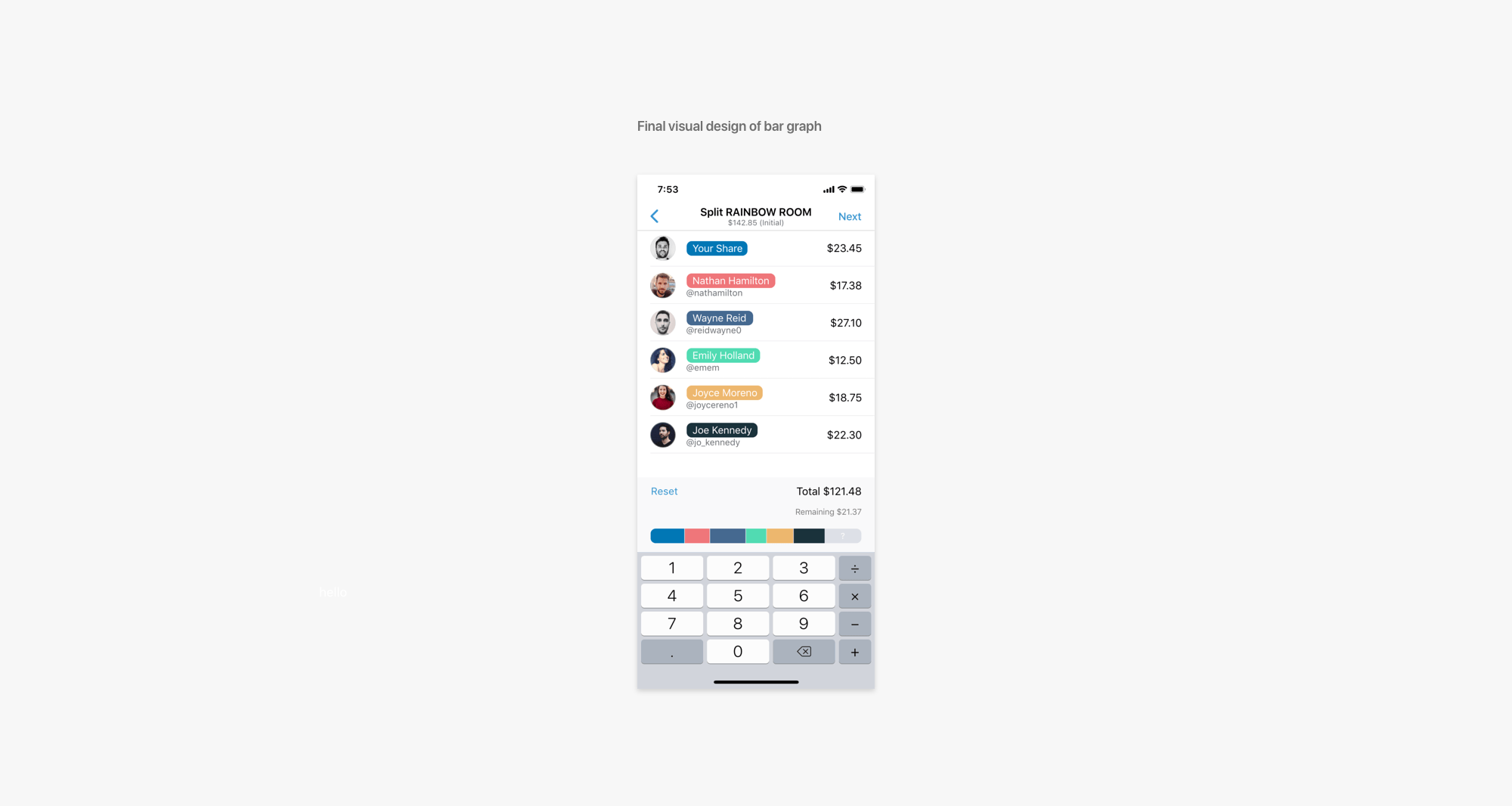
The colors above is an example of such palette. The example is hand picked from a set of colors generated by a site called coolors.co. Below is a high fidelity prototype with the color palette applied to the stacked bar and name badges.
Ideating + Prototyping: Remaining Cost Allocation
I next tackled dealing with remaining cost allocation. Upon user feedbacks, there had to be a better method of dividing up any remaining cost. Consider this scenario: everyone just notifies the main payer just the cost of their food items, no tax or tip included. The main payer would have to calculate dividing up the remaining cost proportionately to evenly distribute what would be the cost of tax and tip.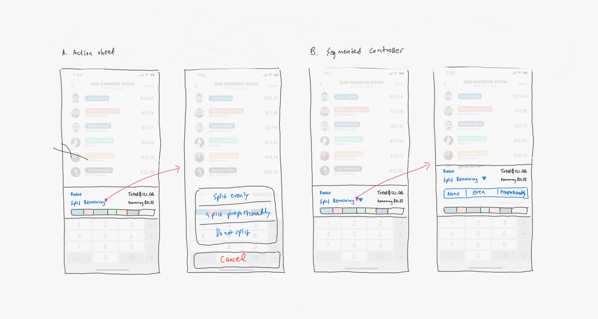
It is very tedious, especially on a smartphone on which you have to go back and forth between the app and a typical 4-function calculator.
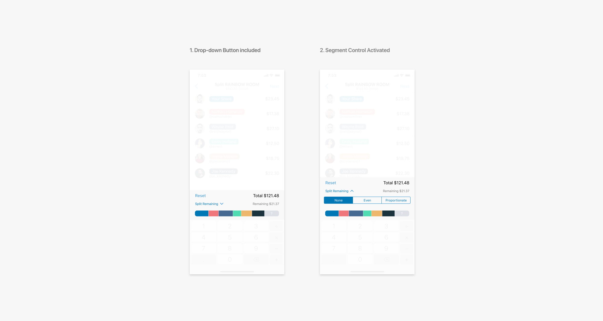
Why not directly include the ability to divide the cost proportionately? Or maybe just dividing it up fairly into even amounts. Or maybe none. Just leave the option to the user.
Another potential option was a button that would lead to a different page with the options. However, it seemed best to provide the options within view of the stacked bar as to see payment changes, and option B was the best at doing so.
- Remaining cost division placed in action sheet.
- Remaining cost division placed in segment controller.
Another potential option was a button that would lead to a different page with the options. However, it seemed best to provide the options within view of the stacked bar as to see payment changes, and option B was the best at doing so.
Final Prototype
Study and tests on whether the new Split Pay improved user experience will be coming soon. But for now, here is the Split Pay page in layers.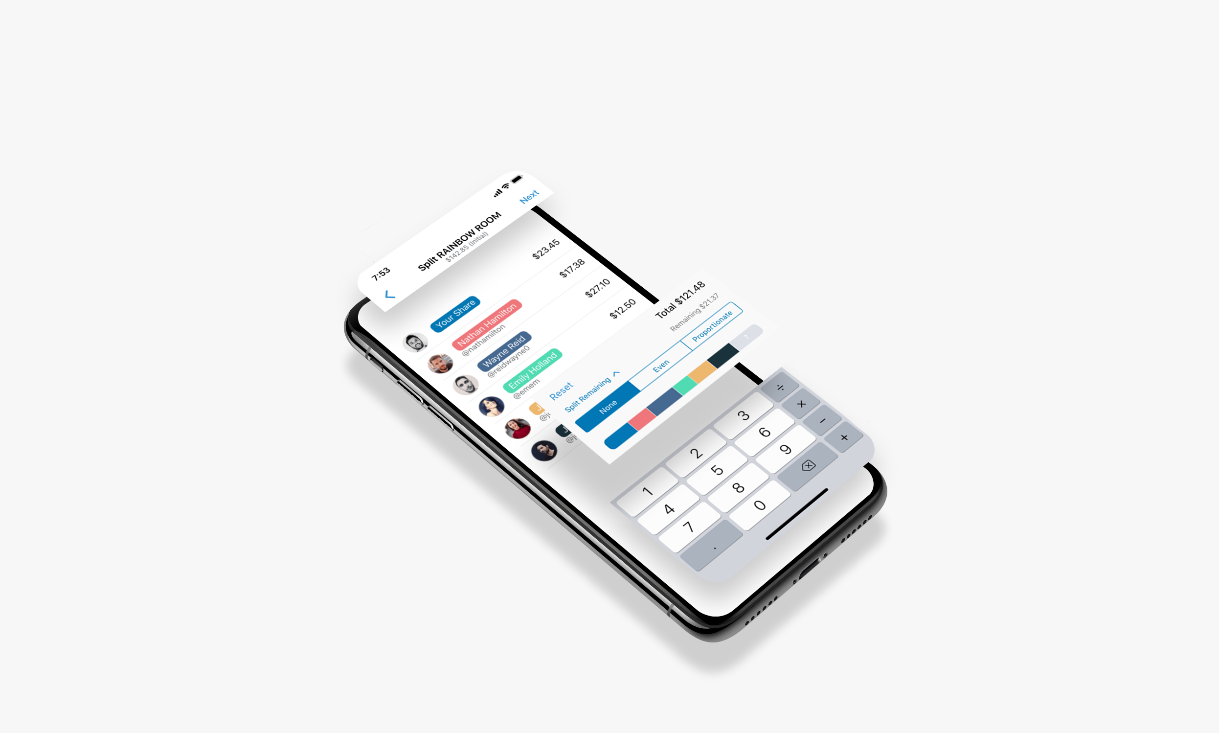
This is a demonstration of the updated Split Pay. In the video, the user is clicking on the 'Split Remaining' button to reveal the segment controllers. Here the user can switch between the three options.